Showing posts with label circles. Show all posts

Friday, January 20, 2012

artist statement

handle with care, 2010


crappity, crap, crap.  i have to write an artist statement.  this is a hard one for me.  i am not into the "deep" stuff as far as statements (or art) go.  i make art, i play, i sometimes get a good result.  i like objects, people, shapes, patina.  i like all that stuff to look nice together.  i like color.  it's fun to put colors together that look beautiful.  for me, it's not about something higher.  it's just putting all of the elements together until i get just the right combination.  and then i'm done, and ready to do it all over again. 

here are things i like to use in my art over and over:

circles--they seem safe and comfortable.
stripes--they just look orderly to me, and i'm a virgo.  love order!!
lines--well, i don't know how you'd create something without at least an implied line...do you?
ordinary objects and people-- they are interesting to me.  i like the mundane for it's simple beauty.
red--it's happy.
green--it's safe and comfortable, like circles.
blue--i used to hate it, then i forced myself to use it because i hated it.  and now i love it.
brown--it's like green only safer and more comfortable.
texture and patina--i love things that are used and have the touch of a person or of mother nature.  if it's not there, i try and create it in a believable way.
handwriting--it's almost a lost art.  nobody writes letters any more.  and pencil?  it's just so beautiful!  smudgy, sharp or dull depending on the writer, and that shimmer of graphite.  wow.
numbers and letters--hmmm.  i like to use them as elements, and they usually don't say anything.  just elements of design.  3 is a personal favorite.  i think because it has circles.  i also like X.  so strong for such a tiny thing.
the virgin mary--she's an icon.  i'm not the religious type, but i have a huge collection of Mary in many forms.  she reminds me of my grandmother, who was such a kind woman.  she just makes me feel comfortable.  like circles.  and green.

here is what influences me:

pop culture--sometimes i just drive around and look at stuff.  i call it my artistic education.  it gets my brain ticking.  i look at people, buildings, products in the stores, old stuff, trash, fashion, advertising.
old stuff--back to the patina thing.
magazines--(all types including boring ones like consumer reports). i'm kind of addicted.  it's like driving around, only sitting still.  and you can bring them in the bathtub.
graphic design--letters, numbers, color combinations, flattening of the picture plane.
artists--oh god.  i look at everything i can.  how can i even make a list?  i could start today, and not finish for days.  it's impossible.  

i wish i were the kind of person who could take all of this information and make up a gorgeous paragraph or two that turns into an artist statement.  i guess i am going to have to do that really soon.

Monday, August 15, 2011

no title yet...but another box finished!!


finished this one last night.  i have had the clown knock-down target for at least 5 years.  i bought it up in silverton, colorado, at an antique store there.   i loved the hand-painted surface, and the patina of wear.  at the time i paid $24 for him, the price tag was still attached!  i created the monoprint in the background with the same color scheme, and tried to get a whimsical, fun pattern to work with the clown.  the roulette wheel was purchased on ebay, it's really old, and is marked "made in england".  the front of the box is a loom of some sort, and each sawtooth-shaped spike was hand-cut with a saw.  the discs on the front are made from some old poker chips which have paper circles overlapping them.  i cut them from a monoprint.  

john made the box for me.  it's made from oak, and has beautiful dovetailed corners.  it measures about 10x15x3 inches.  it can hang or sit on the legs i have installed discretely on the bottom of the box.

there is really no story attached to this box, i just loved the pieces individually, and think they look really nice together.  sometimes when i create a box, i'm telling a story.  and sometimes i just like to play around with combinations of elements.  

here's an image of silverton from a 1950's postcard.  it still looks exactly the same!

silverton, colorado


Wednesday, June 1, 2011

submission

shoot out, 12x12x4 inches
this is one of two pieces i will be submitting to the all colorado show.  i know i have posted this piece before, but i'm kind of in a strange place as far as work goes.  i have 3 new boxes that have never been seen in any venue, but am saving them for a show in october.  i have also been working on prints, but am saving them for october as well.  i made this box a few months ago, and thought it might be a good fit for submission.  john was nice enough to make the actual box.  he uses plywood, and then runs it through a dovetail jig to make the joints.  these boxes are very strong because of the dovetail joints.  i think they could probably survive just about anything.  anyway, on this particular box, i used old yard sticks for the trim on the front, and also to line the inside.  you can see the usual suspects in my choice of materials...old stuff, objects with numbers, metal things, boxes, toys, and old handwriting.  i'm not sure why i am drawn to those particular themes, but they show up over and over in my work.  i also like circles, and the outside of this piece is covered in them!  they also show up in the old ring toss target.

i read lots of artist statements, and everyone seems so smart, so deep, and so introspective when they write them.  writing the artist statement is really tough for me.  making art to me is explained simply.  i'm not trying to make a huge statement.  i like things with age and patina.  i like color.  i like to put elements together like a puzzle to make things that are beautiful.  i choose stuff because it calls to me, not because it is saying anything that is particularly significant in the world.  i also like a bit of humor, but not too cutesy.  hence, the headless cowboys, taking aim at one another, obviously beyond the point of no return.  i call the box "shoot out", but the name is really for identification, not to inspire deeper meaning.  

i don't mean to suggest that my work is uncomplicated.  i spend hours and hours getting just the right combination of elements.  assemblage, i think, is highly misunderstood.  many think you just stick stuff together, but it's a lot more difficult than that.  the magic word is puzzle.  it's a puzzle with no picture on the box top to help you get the pieces in the right order.  that's up to the artist to figure out.

Monday, May 2, 2011

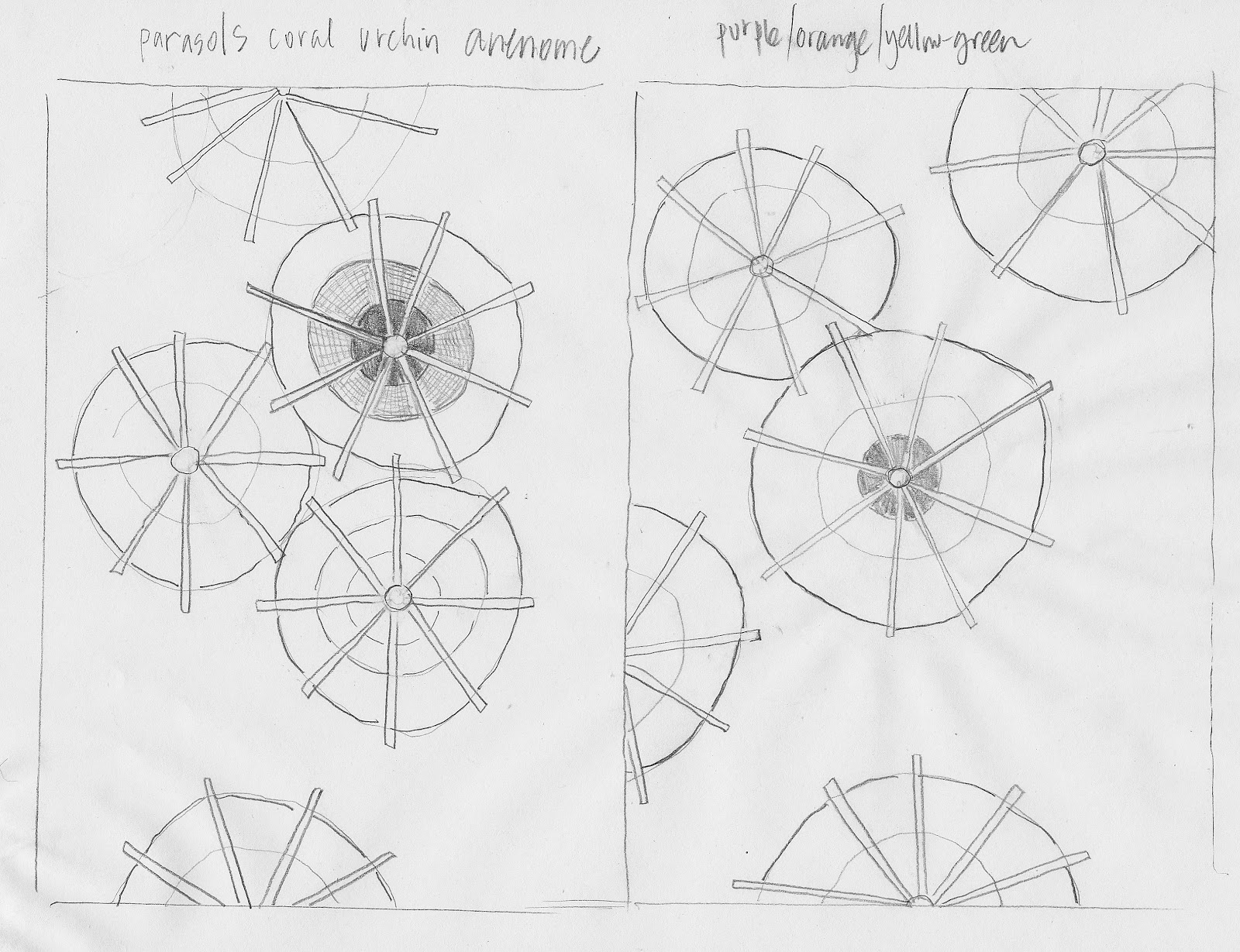
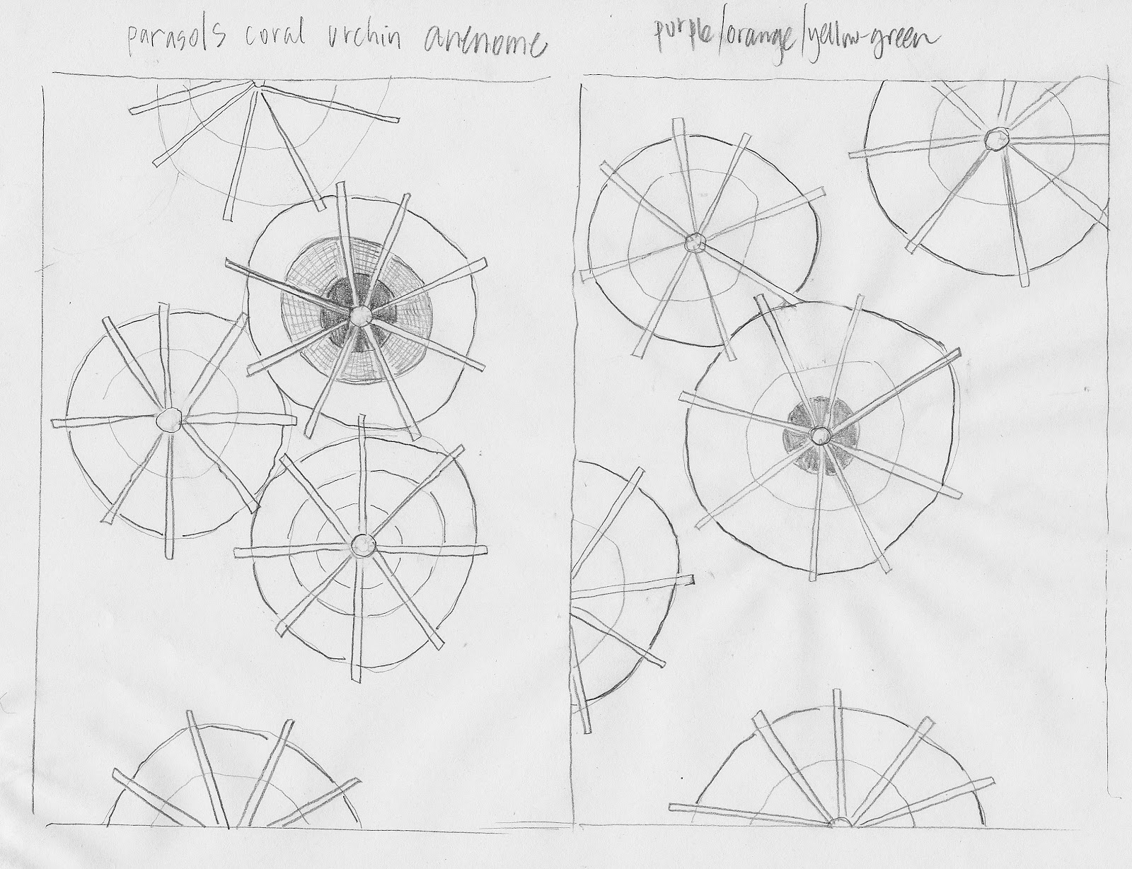
parasols


new collage idea.  kinda evolved from the garden theme i was pondering.  i spent the morning painting various papers in purple/plum/orange/yellow-green.  i am excited!  i'll post the results when they come to fruition.  or should i say unfurl?  inspiration from lots of places...the drink umbrellas i glued in an old sketchbook, sea urchins, coral formation from a book john gave me on geology, and of course circles.  circles show up in my work over and over and over.