Sunday, September 5, 2010

thrift shopping

i have been shopping for vintage stuff for the past week. i have been in a bit of a lull on the vintage stuff. i just haven't been able to find any cool stuff lately. john and i went to an auction about a week ago thinking that was the answer, but after about 5 hours of waiting for the "good stuff" i ran out of steam. i lost it when the auctioneer moved from the front of the room and started auctioning off things one at a time on the tables. it was too much for me to handle. i would not be able to do the auction thing very often if i had to.

so i decided to look around this week for stuff in other places. i went to lots of thrift stores, and was pretty lucky. i also asked john to go through some of the old tools he has, and we came up with a box of cool things. i also went to the outdoor paris flea market down on santa fe. and i came out with a bag of fun items.

ben had a race in winter park this weekend, and i went up on saturday after the paris market. it was nice and cool up there, which was way nicer than denver where it is HOT. john and i drove to granby this morning to check out a little antique store there, but alas, it had the "closed" sign on the door even though they said they were open on sunday. drag.

i drove back after lunch (did i ever mention how much i hate driving in the mountains? well, i do hate it, and was very happy to be done with berthod pass, thank you very much). anyway, i decided to go to the thrift stores on broadway on the way home. i found the letters pictured above!! now i know what the ceramic letters i have been using are for! they were made as title letters for home movies! you could spell out whatever you wanted on a background and then film them. or you could glue them to glass and shoot through them. so awesome. the neat thing was you could light them, and since they are 3-D they cast a shadow, making a cool effect. did i mention that they were only $1.49? deal of the day!! i am thrilled beyond belief.

the race...ben did okay, and was feeling good about it. he raced dual slalom, and tomorrow he races downhill, which is more of his passion. i hope he does well, but really it is about being out there more than anything else. he really looks like a man this year. i guess he is no longer my little boy. sigh.

Wednesday, September 1, 2010

no strings

so i didn't get my stuff into the show. that's ok. i have to build up some thick skin. i was kinda down yesterday and so i painted this (very ugly hideous painting that i had to delete before it made me crazy). it's a bit different from my usual. i'm calling it "no strings". i'm not quite done. feel like the hands and feet need some work. and maybe the yellow is too bright? (or maybe i could just rip it up and try again?)

anyway, it just came out of my brain yesterday. frustration with being a new artist in an old world. that's why she's naked under that dress (and she looks like a freak). feeling really vulnerable. the whole thing is a little (a lot) high school, really. but it made me feel better. maybe i have worked through actually cutting some strings. isn't that what art is about? sometimes it's not the product (thank god), but the process. this one will always remind me of the feelings i had on that day. and it will probably never go in a a frame or be sold (more like the trash can). it's more like a diary entry, only bigger! ha!


Friday, August 27, 2010

upper and lower

another new one, finished last night. this is a very different color scheme for me. light and pastel-y!

this piece is in-keeping with another i did about a year ago, called "gossip", which is now sold. i really liked the look of the small frame within a frame layout.

these letters are plaster (or ceramic?) and have pins or nails embedded in them so that you can press them into a material to create a sign. when i got them they were in their original cardboard holders, which had gotten wet. so each letter was rusted into the cardboard, and had to be picked out with nimble fingers and tweezers. it was worth it, though. i love them.

off to the studio today, and again on saturday. i don't know what i will work on today. maybe more prints? i have found it almost impossible to work on boxes there. i need too much stuff, and i usually don't find the right combination until i try many many many objects. so painting or printmaking is usually a better fit for me there.

i still need to fit the back and add hanging hardware to this one. then it will be added to the website for sale.

Thursday, August 26, 2010

whose?


this is my new piece. it's called "whose?" because on the old tobacco card it says "firm lips humorous eyes (whose?). on the back it tells you it's clark gable. i thought it was funny. i have had this card for a while and just now found a place for it.

people are confused about the descriptor "assemblage" at the shop. they keep asking me if that means "mixed media". i suppose i am making mixed media pieces when i do the boxes, but i would rather call them assemblages because they are created mostly with objects. it seems like a better word to me. mixed media implies that the work could be flat. and it's not.

i am entering this one in a show. it's being judged by a prominent gallery owner here in denver. i am hoping his eyes think my work is worthy. cross fingers. i hope the fact that it didn't photograph as great as i wanted doesn't ruin my chances. the copper looks white-ish in the photos, and it's not. weird.


Tuesday, August 10, 2010

not my day

this is what i found when i got to the shop today. another painting on the floor with broken glass. this is the second one in a week. they are doing construction next door, but say they have not been banging on the wall. hmmmmm.

i think i will spend today sticking sticky tac on the back of all of my work. grrrrrrrrr.

the bad news is that teresa lost a platter and one of my pictures hit one of her radios and dented it. tom is the lucky one. but he has no work on this wall, so he was out of the danger zone.

that's it for today. i need to concentrate on something happy...like artwork??

Thursday, August 5, 2010

little boxes

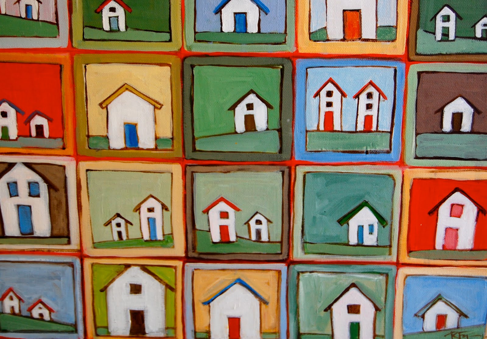
a new painting that measures 12x30". it's acrylic on a deep wrapped canvas. i like the whimsical look and the bright cadmium red. not too serious.

i had two days in a row in the studio. i have been putting out the prints like crazy, and decided i needed a break. i divided up the canvas, and worked out the color scheme of the boxes. i kept trying to get an abstract painting. for a whole day i painted and painted, experimenting with layering and dripping. it just wasn't working out. on the second day i was walking to the bank and got the idea of the houses in each box. i wanted them to be simple (there's a lot!!)

so i just started putting them in each box (i needed to paint all of the drips out first, which really was a big pain in the butt). the end product came out pretty cool. it's a bit folksy but still modern. and i like the fact that everything is a little off and crooked. and it was fun!! isn't that the goal? to enjoy what one is doing? well, i sure am!!

btw, i tried to download the whole painting but because the blog edits the dimensions of the photo, the whole thing won't show. too long and thin for the space. sorry. i will try to get a full shot on the website if i can figure it out...check it out on sk3tchbook.com

(later) i did it!! i was able to finally put a full-sized image on the site! you have to click on the detail, and then it will come up on the next page. call me brilliant, huh?


Saturday, July 31, 2010

i'm having so much fun!!

some more finished prints today. with the new ink from gamblin. i am having a blast with this. now if i could only keep the margins clean so i don't have to mount every print...i would like to show the edges of this beautiful paper...but i am a mess. i get so excited with the process that i can't even think about keeping it all tidy. my mother would be telling me to slow down and be neat if she were alive. "ruth claire, you need to stop being such a mess", she would have said. i will listen to her next time, i promise!!

my hope is that people will "get" these. that's the problem with abstracted images...people sometimes don't get it. i was thinking today that i am really into just trying to solve the problem of getting something that looks beautiful...i really don't care if it looks like something. i named both of these works "trees" because they remind me of sitting under a tree on a breezy day when the leaves overlap each other as they move, but i could have just as easily called them "composition in green and brown".